When the 2020 census results are released, we will be deluged with news stories trying to interpret what the changing population of Atlanta and Fulton County will mean for our school zones, political representation, and business decisions. Key to understanding and interpreting this new information will be Data Literacy, a term that did not exist when many of us were in school.
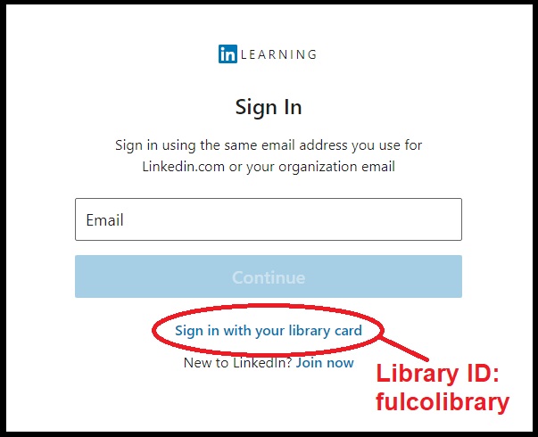
According to Bill Shander in his LinkedIn Learning course on Data Visualization (Library ID: fulcolibrary), Data Literacy is the ability to read, work with, analyze, and argue with data. In order to prepare for the massive data drop from the 2020 census, now might be the time to take one of Shander's many courses on the subject on LinkedIn Learning (formerly Lynda.com).

Already have a handle on the basics? Then try Barton Poulson's course Data Fluency: Exploring and Describing Data.
Understanding how data can be used and interpreted is doubly helpful if you want to use this new information to make plans for your business, school district, or neighborhood. Data Axle is a tool that anyone can use to explore information available about the people and places around them. Free online courses demonstrating how to use Data Axle are held every first and third Thursday each month at 11am EST. Learn how to use the tool to grow your business in their free class Entrepreneurship: Research for starting, managing, and growing businesses every second and fourth Thursday at the same time. Just don't forget to register ahead of time!
If you'd rather read up on Data Literacy instead of attending a class, try a title from our Overdrive collection on the topic. With all the statistics in the news, learning how to understand and interpret these numbers can be crucial to understanding the communities in which we live.


Add a comment to: Understanding Numbers in the News – Data Literacy